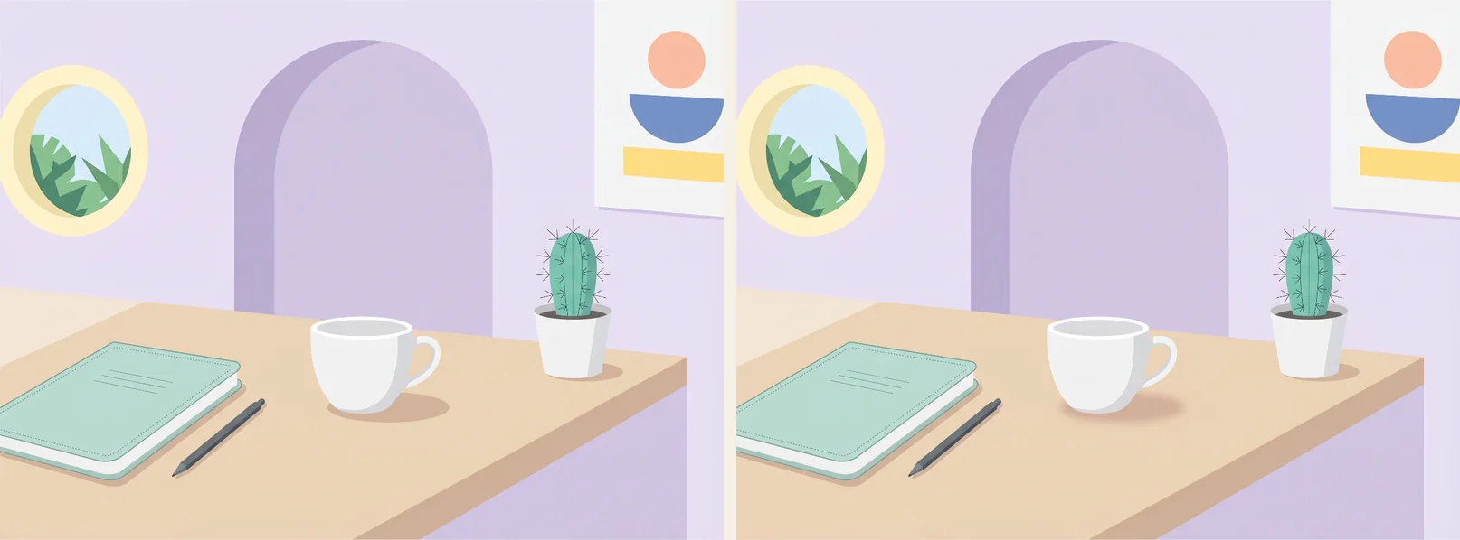
Putting two slightly different pictures next to each other takes about a minute. Making a level that people finish and then immediately start the next one is a lot harder, and for a long time we couldn't really say why some of ours worked and others didn't.
After playing through our own packs and a lot of community ones, a few patterns became pretty obvious. None of this is a law. But when a level feels off, it's usually one of these.
The picture has to be readable
The best puzzle images have lots of things in them. A kitchen with jars and spoons, a market stall, a kid's bedroom, a harbor full of boats. Every object is a place where a difference can hide, so more objects means more to search.
But you also need to understand the picture within a second or two. Objects should have clear outlines and not melt into each other. There should be some quiet areas, a wall or a bit of sky, where the eye can rest. And things should be roughly where you'd expect them. A lamp on the ceiling is funny once. After that it just makes the search harder in a way that doesn't feel earned.
What almost never works is a picture that's mostly texture. A forest, a pebble beach, a crowd, some abstract pattern. You can hide a difference in there, sure. But when players finally find it, they don't feel clever. They feel like they got lucky.
Hard is fine. Unfair isn't.
The level in the picture above is from our 3 hard ones pack. Three differences, all well hidden. You can be stuck on one of those levels for quite a while, and that's okay, because once you find a difference, it's clearly there.
That's the test we use for everything now. When someone sees the solution, do they go "oh, of course" or "no way, that's not fair"? The first is good difficulty. The second means the level needs work.
The "oh, of course" kind usually comes from differences that are small but clearly visible once you look in the right spot. Or they sit somewhere people don't look, like a corner or the background. Removed objects are naturally harder than added ones, and that's fine too. A color that changed only slightly can work, as long as it's actually a different color.
The "that's not fair" kind is almost always one of these: a change of a few pixels, something hidden in grain or blur, a difference you can only see at full zoom, or, the worst one, an AI artifact that looks like a difference but isn't marked as one.
Mix it up
A level with only hard differences is exhausting. A level with only easy ones is over before you've really started. Most of the levels we like have a sort of curve to them:
| How many | What kind | Why |
|---|---|---|
| About a third | Big, colorful, obvious | You get going and feel good about it |
| About half | Smaller things, less obvious places | The actual search |
| One or two | Well hidden, but fair | The one you'll remember |
For most scenes, five to ten differences feels right. Less than five is thin, unless every one of them is tough, like in 3 hard ones. More than ten turns into work.
Spread them out, too. If all the differences are in the left half, people find the last one by elimination instead of by looking, and that's a bit of a letdown.
It also helps to vary the kind of change. Something added, something removed, a color change, something bigger or smaller, an object swapped for a different one, a small detail like the time on a clock. Moved objects are the hardest to spot, because you have to compare positions across two separate pictures. We use them rarely and usually only once per level.
Illustration or photo?
Both work. Illustrations are easier to play, especially on a phone. Clear outlines, distinct colors, no image noise that could be mistaken for a difference. Our Cartoon pack is basically built on that.
Photorealistic scenes look great, like Landmarks or Messy rooms. But real surfaces are full of fine detail, reflections, and grain, which makes clean editing harder. Differences in photos need to be a bit bigger to stay fair. If you're not sure, a slightly stylized, realistic look with clear light is a good middle ground.
Look at it on a phone
A lot of people play on their phones. Something that's obvious on a big monitor can shrink to a few pixels on a phone. Before publishing, look at the level at the size people will actually see it. Players can zoom, but if a difference only works zoomed in, it's too small.
And keep a pack consistent
Packs feel best when all levels share a look and a theme. The pack description is applied to every AI image in the pack, which does most of the work there. Levels unlock one after another, so the first one should be on the easy side. It decides whether people stay.
Before publishing, we ask ourselves a handful of questions. Can you tell what the picture shows right away? Is there a mix of easy and hard? Are the differences spread out? Would a player say "oh, of course" for every one of them? Are the two images identical everywhere else? Does it work on a phone? And has anyone besides the person who made it actually played it? That last one catches more problems than all the others combined.
If you want to build one yourself, here's how the editor works.